A brief comparison of Rev's rendered font sizes with those of the OS and of Firefox, across all three supported platforms. RevEnterprise 4.0 and Firefox 3.6 were used for all screenshots. All tests were done with the same display hardware under virtualization (Parallels).
Text font of main body field in both Firefox and Rev set to "Courier 10-pitch" (because Firefox doesn't show "Courier" in its font menu, even though Rev does), at 13 points. But note that the header field in the Rev stack is set to 10-point FreeSans, and the title of the window ostensibly uses 10-point "Sans" - very different sizes.
Here the text of the main field in Rev is set to the same "Courier" font as Firefox is set to, at 13 points. Again, identical size rendering (though a difference with antialiasing). But also note that the title font is "Lucida Grande" at 13 points, which looks very much the same size as the header field of the Rev stack.
Here both Rev and Firefox use "Courier" at 13 points in the main field, with the header field in the Rev stack set to "Trebuchet" at 10 points, which is the OS spec for the title bar. While the body text renders the same in both apps, the header field is clearly smaller than the text in the window's title bar.
Here we see what Ubuntu's Appearance dialog reports as 10-point "Sans" as the text for the buttons and dialog text. In the Rev example below it we see 12-point Helvetica (Rev's default font on Linux) used for the dialog text and controls. Obviously 12 should be larger than 10, even with a different font; but not so in the rendering.
f
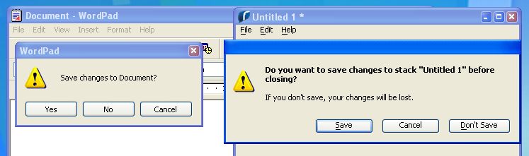
Here we see another very strange anomaly: the menu and button text for WordPad on the left is reported by the OS "Appearance" dialogh as "Tahoma" at 8 points, but the nearly matching text in Rev's menu bar and controls on the right is reported as "Tahoma" at 12 points. It's a close enough match to get good results, but we see a disparity between how the OS renders point sizes and how Rev renders them.
Here's a side-by-side comparison of Rev's default button sizes and font attributes for them as shown in the Answer dialog.
On Windows there's a significant disparity between reported sizes, but as we saw above the default choice in Rev is a reasonably good match (though as with Mac some fine-tuning of textHeight or topMargin could improve the look). On
On Mac we see a nearly perfect match, with a one-pixel vertical disparity in placement but no noticeable disparity in rendered text size.
On Ubuntu/Gnome we see the biggest difference, where the OS default size of controls is nearly twice as large as the two leading OSes, and a significant disparity between reported text sizes.
| OS | Rev | |
| Ubuntu | 
Sans 10 |
Helvetica 12 |
| OS X | 
Lucida Grande 13 |

Lucida Grande 13 |
| Win XP | Tahoma 8 |
Tahoma 12 |
Even with the disparity of reported rendered textSize, it's possible to make layouts that substantially conform to OS standards rather easily for Mac and Win, and the text and control sizes of each are close enough that a single layout will work well on both platforms.
Ubuntu/Gnome, however, uses control and text size so far out of proportion to other OS standards that they require either delivering layouts sized smaller than the user sees in other apps on that OS, or making a separate set of layouts specifically for that OS.